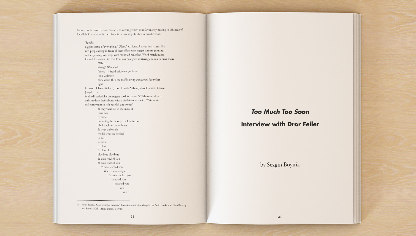
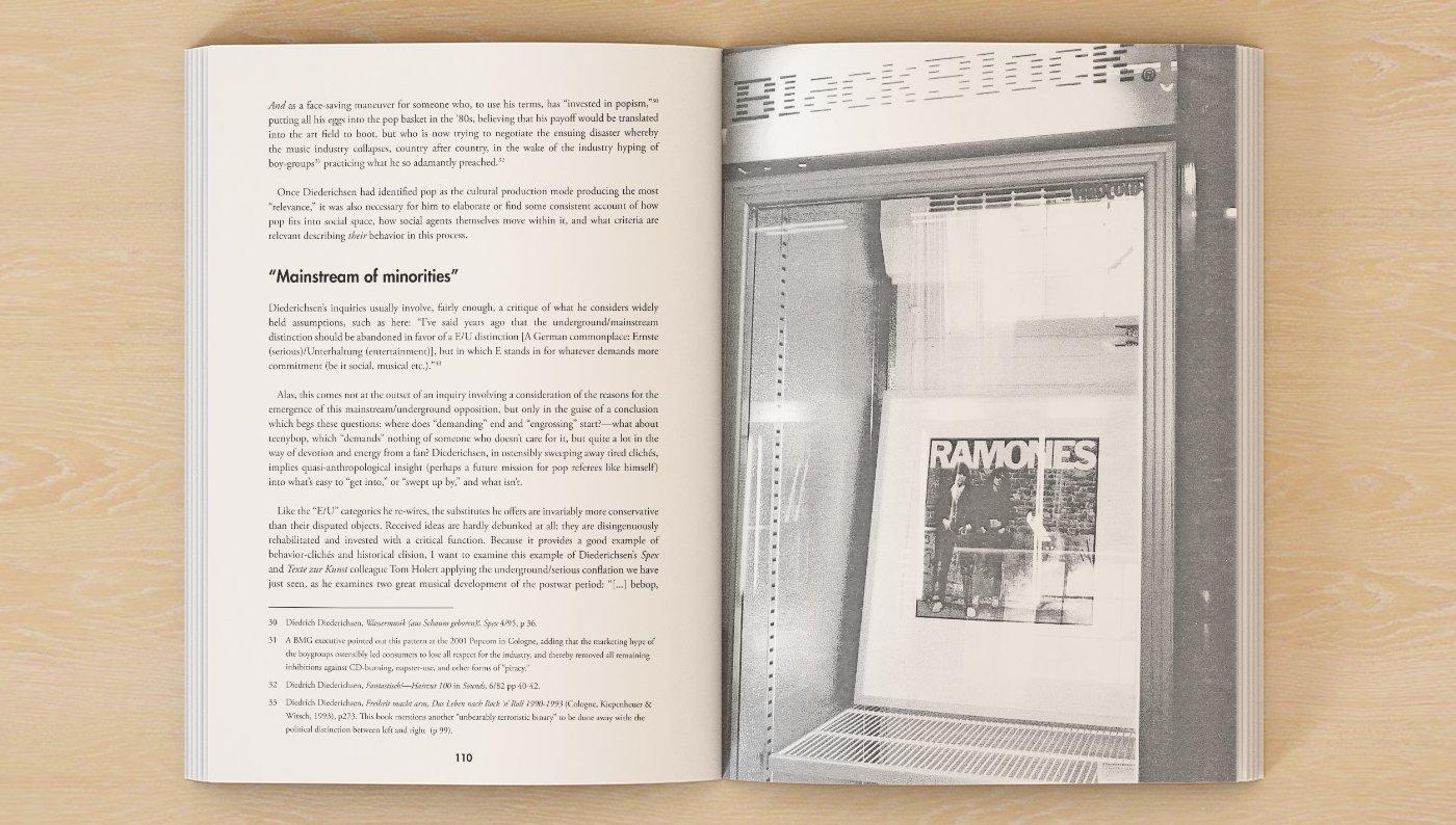
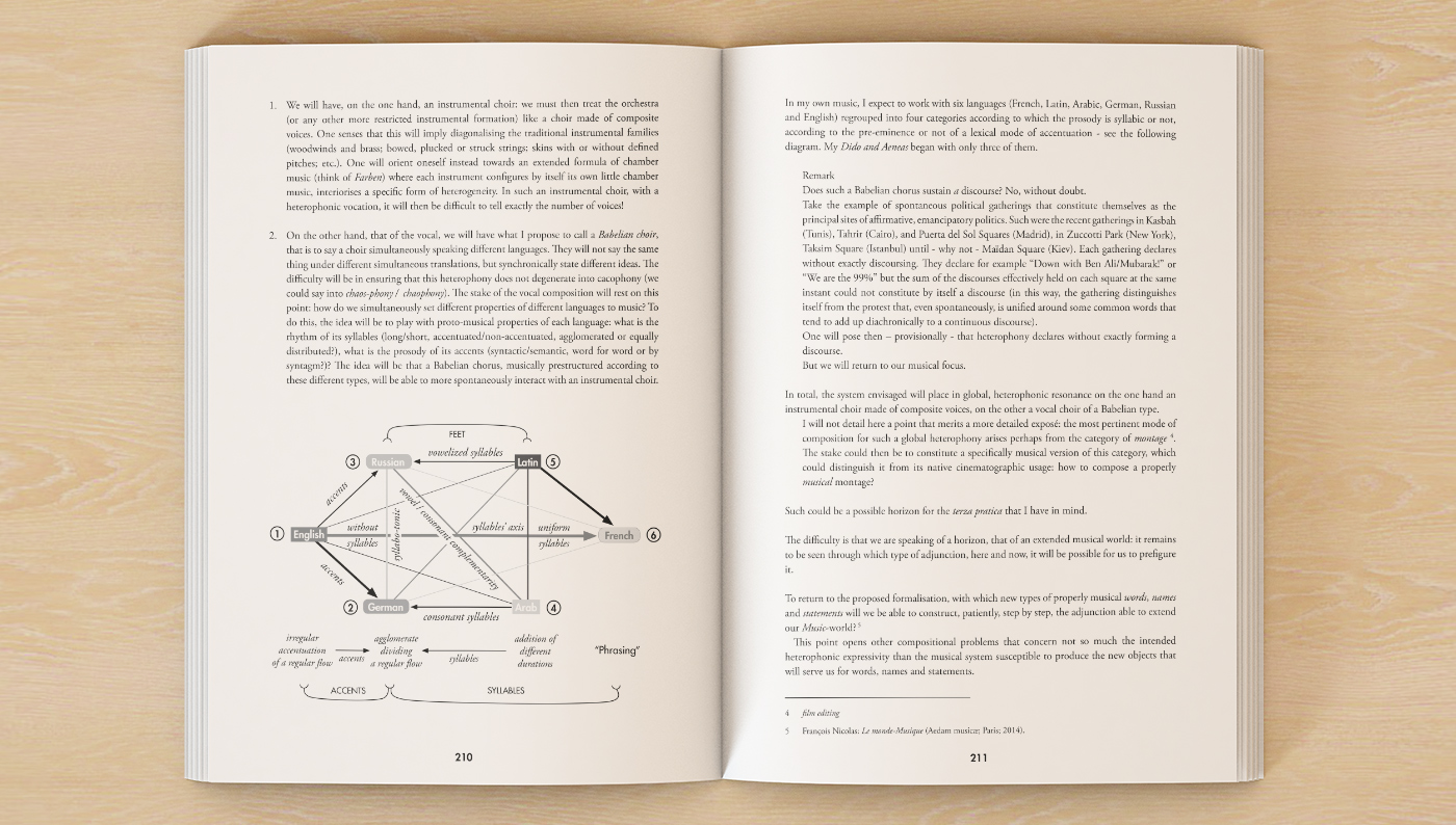
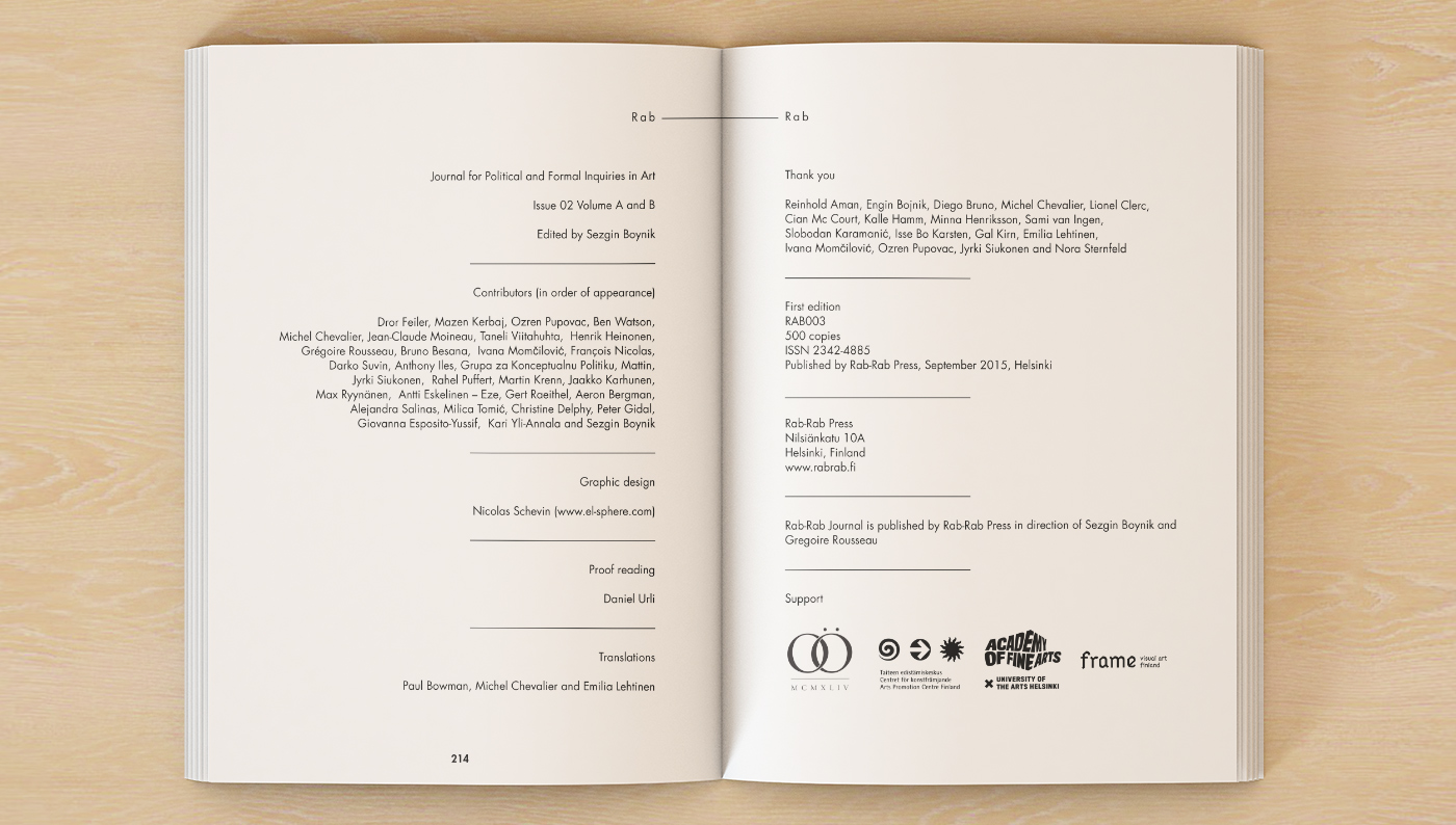
We started to work with Rab-Rab from the very beginning when they had precisely no money. Strong from our work for the first issue and its amazing contents, the publication received an unexpectedly wide acclaim. We realized the Finnish art scene needed such a platform to interact with one another and with rest of the world. Various funding and cultural institutions started to support the project, which allowed us to continue our work in better conditions.
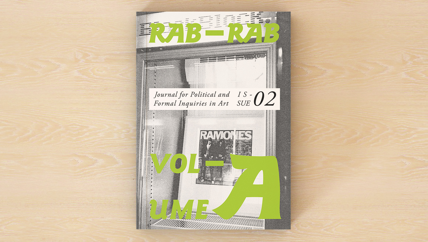
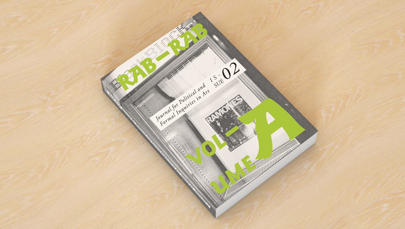
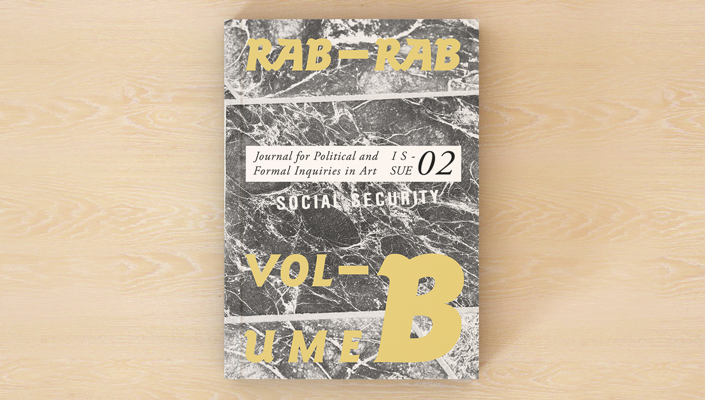
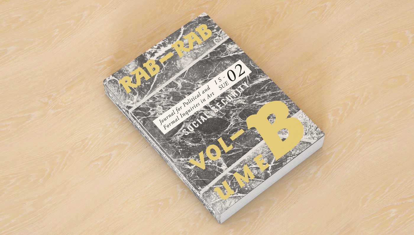
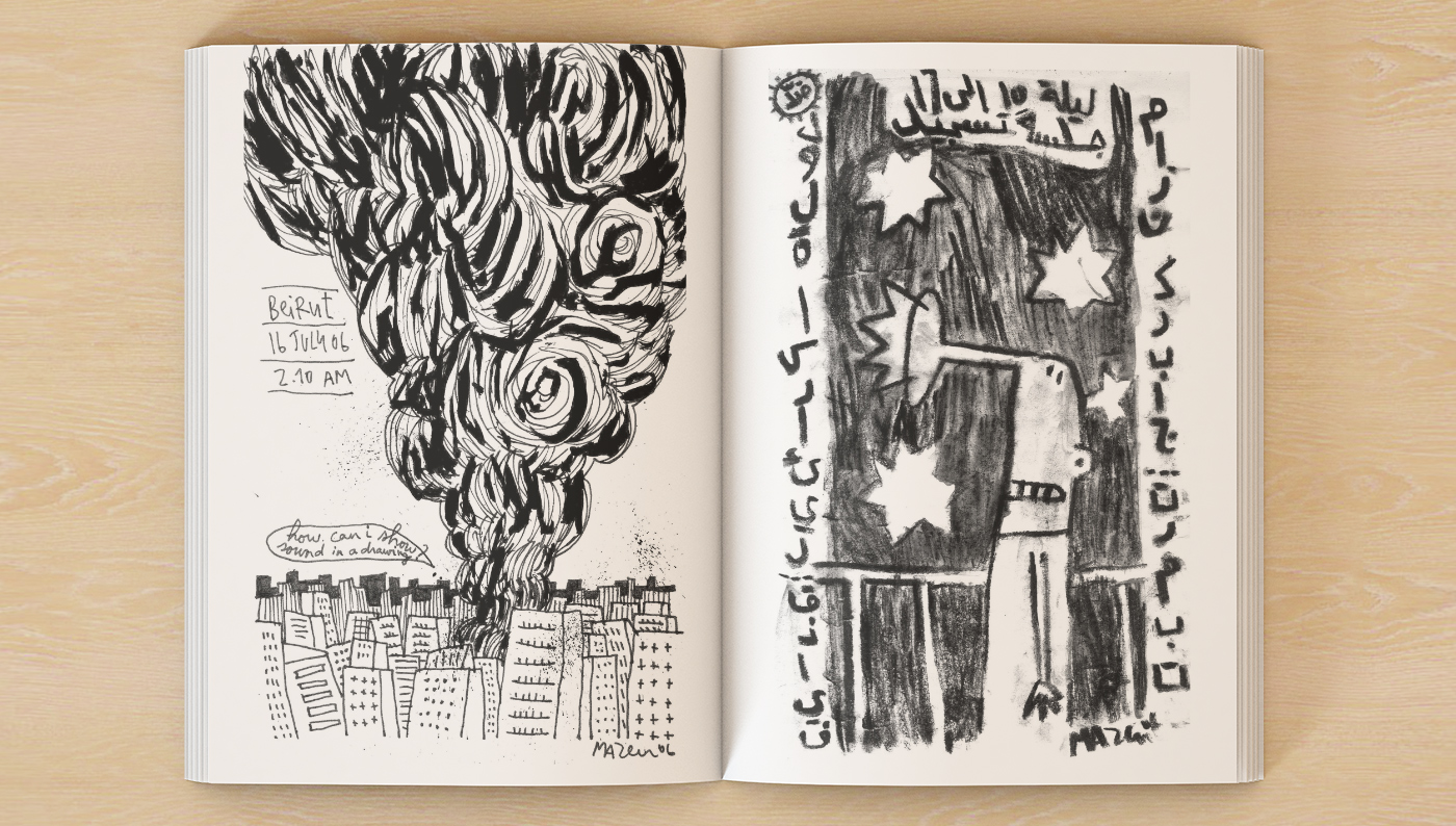
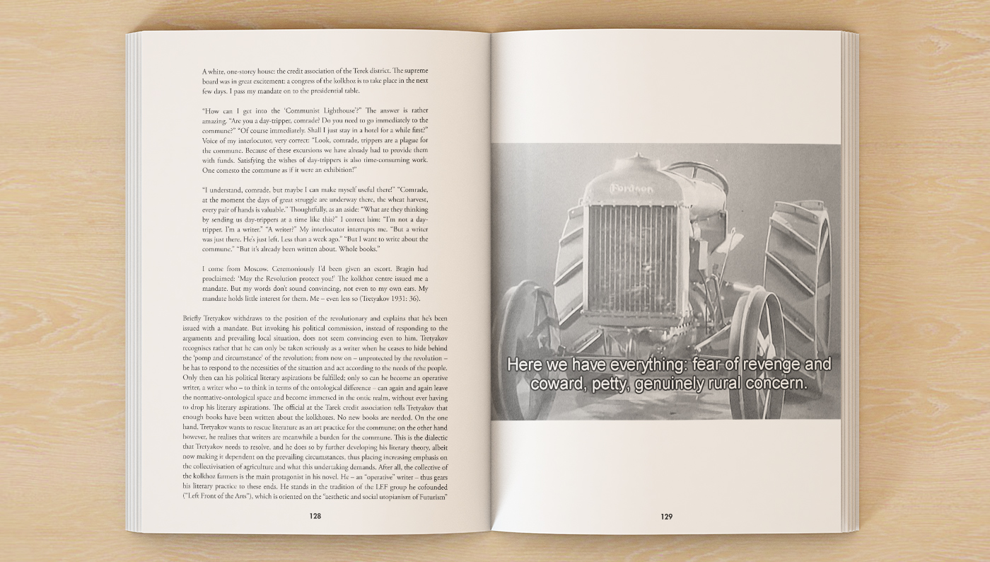
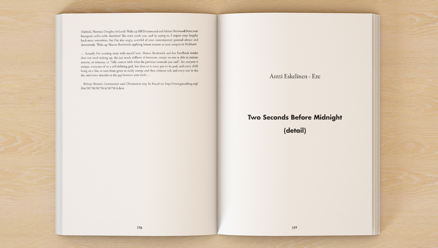
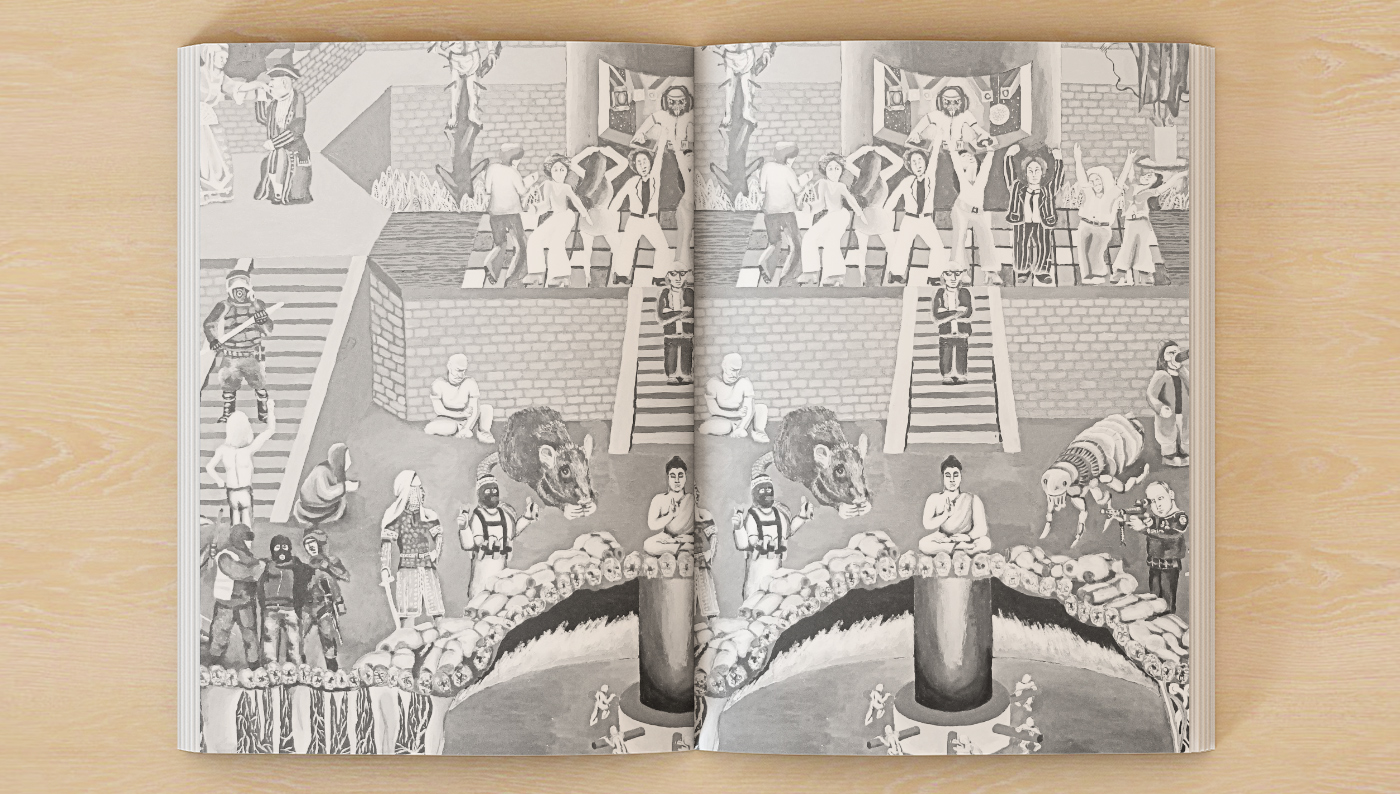
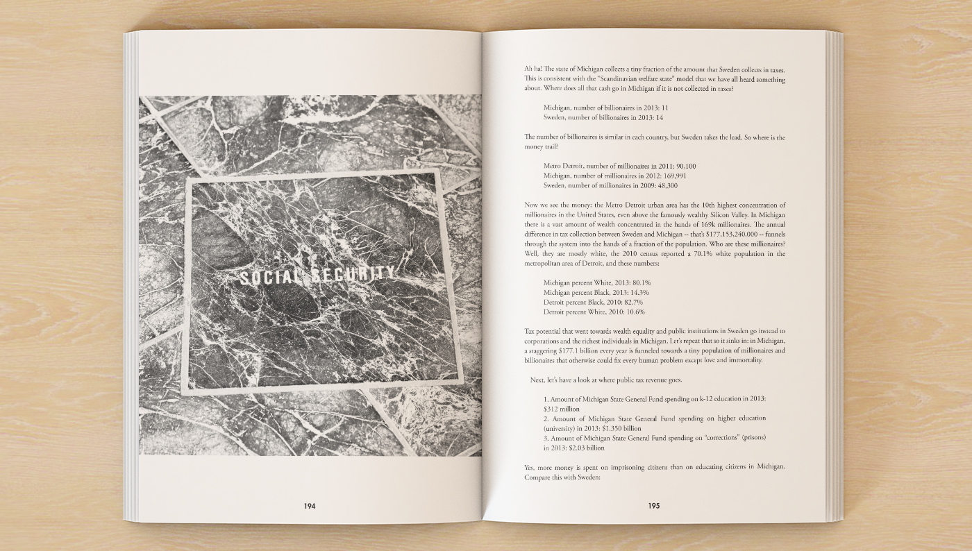
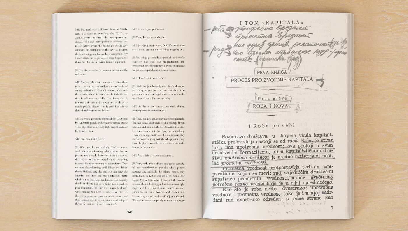
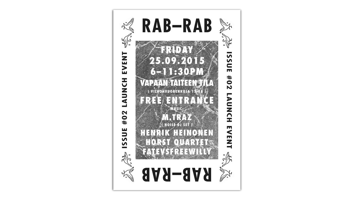
For the second double issue, we found inspiration to break away from the first issue’s visual aspect and created something visually way more ambitious. After developing several identities we ended up abandoning, we went for that extra mile to bring back a radically different and bold layout that could please us as much as the journal team. Instead of producing images that would simply represent the project, we chose to simply select an image straight from the content of each book emerging from the depth of the pages to the cover. The peculiar, old and forgotten font used on the cover was also recycled from the initial documentation provided by the team years before we started the project.
